bvdbogaert wrote: ↑Wed Feb 21, 2024 10:48 am
Do I mind? No I love it, much better.

Would you be so kind to share your workflow on this one?
Regards,
Bart
I don't have a specific workflow per se, just a series of self taught tweaks that I play around with until I get closer to how I think it should look...
I'm sure there are other methods/tricks to do some of this, no doubt some would be better, but this is how I'm doing it at the moment, some work and some don't it depends on the individual scan so I would be doing lots of undo's or stepping back through history when something doesn't work, plus copies of layers to preserve changes or allow for masking.
I've never found a "single' step by step process that works on every scan, which unfortunately makes it hard to share any such a workflow - or as it should be called a 'haphazard' or 'luck' flow.
Case in point is this one, I did it once, just as an exercise, didn't save it. Then spotted your comment on it being a favourite, so decided to post my improved version, but couldn't quickly get it back to where I thought I'd got it - lots more playing around and finally ended up happy with the one I posted... now I'm trying to reproduce it again to give you a specific workflow but so far not been able to get anywhere close! Sorry.
I use Photoshop, and these are the areas I play around with, obviously this will only help if you are familiar with PS
First of all a few obvious things to try;
Auto tone
Auto contrast
Auto colour
Auto Levels
See if any of those improve things.
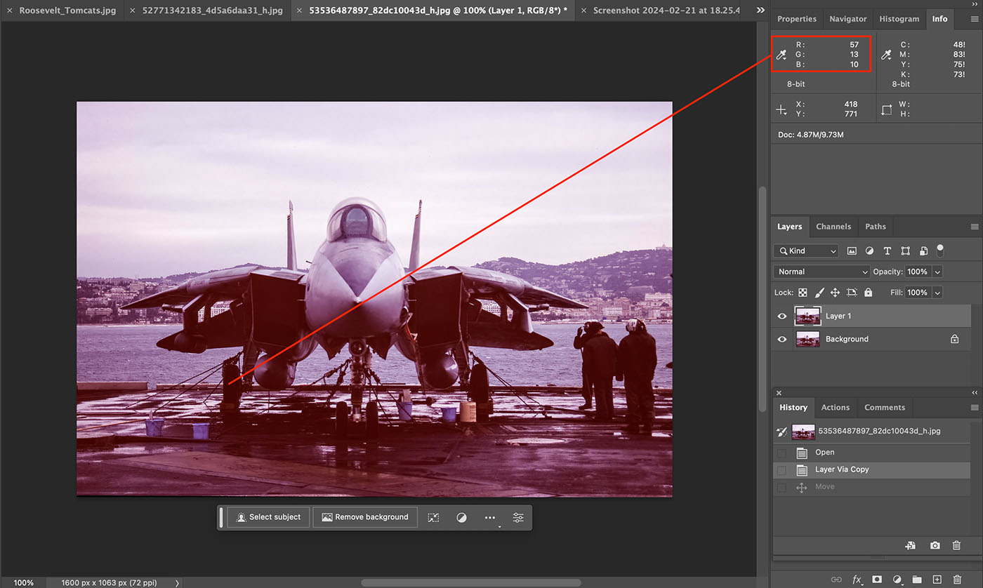
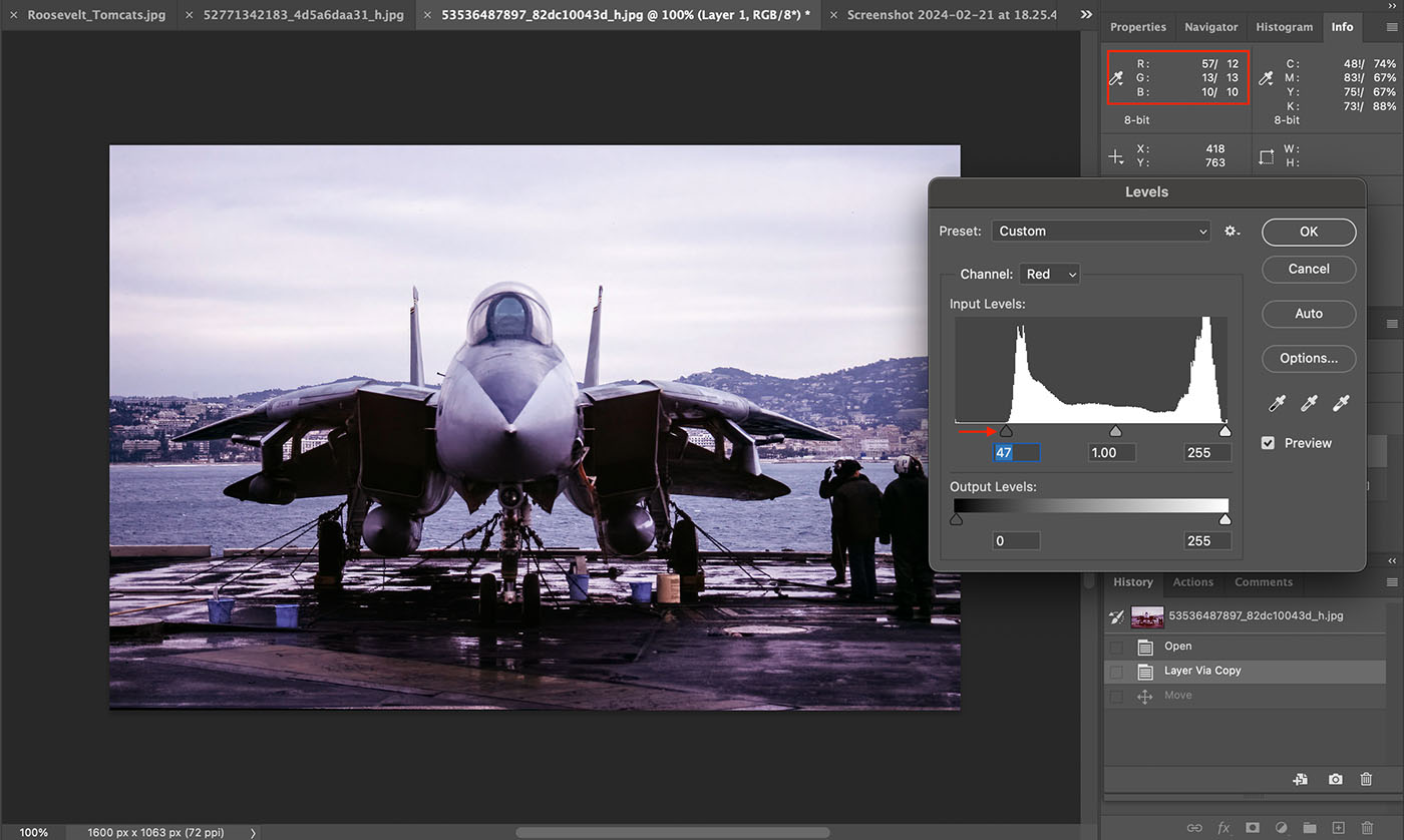
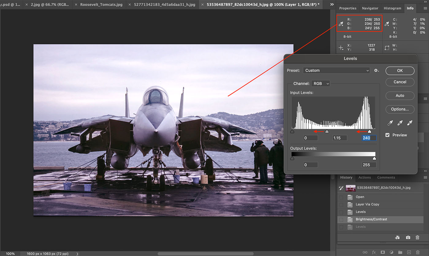
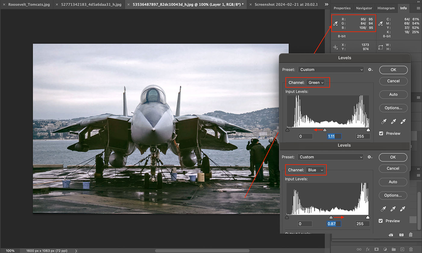
On my own scans of mainly Kodachrome 64 I've found end results are always better if I can then sort of the colour balance of the shadows and highlights... ideally prior to actual scanning or afterwards in PS, so use the colour sampler to check for a cast or imbalance in a suitable black (tyres in shadow are good) and white (look for a white that isn't blown (i.e. has RGB values below 255, 255, 255) and correct them/balance them so that the R,G,B values are close (eg a black area = 11, 12, 14 would be OK), usually do this in levels in both scanner software or PS.
As an added bonus if you can find a suitable mid point of grey (can more difficult than it sounds) then again balancing that at an early stage can help a lot.
Scans often have a fair bit of colour noise so it's easy to pick up a false reading from a single noisy pixel, so move your pointer around a little bit to get a better feel for it's average colour balance.
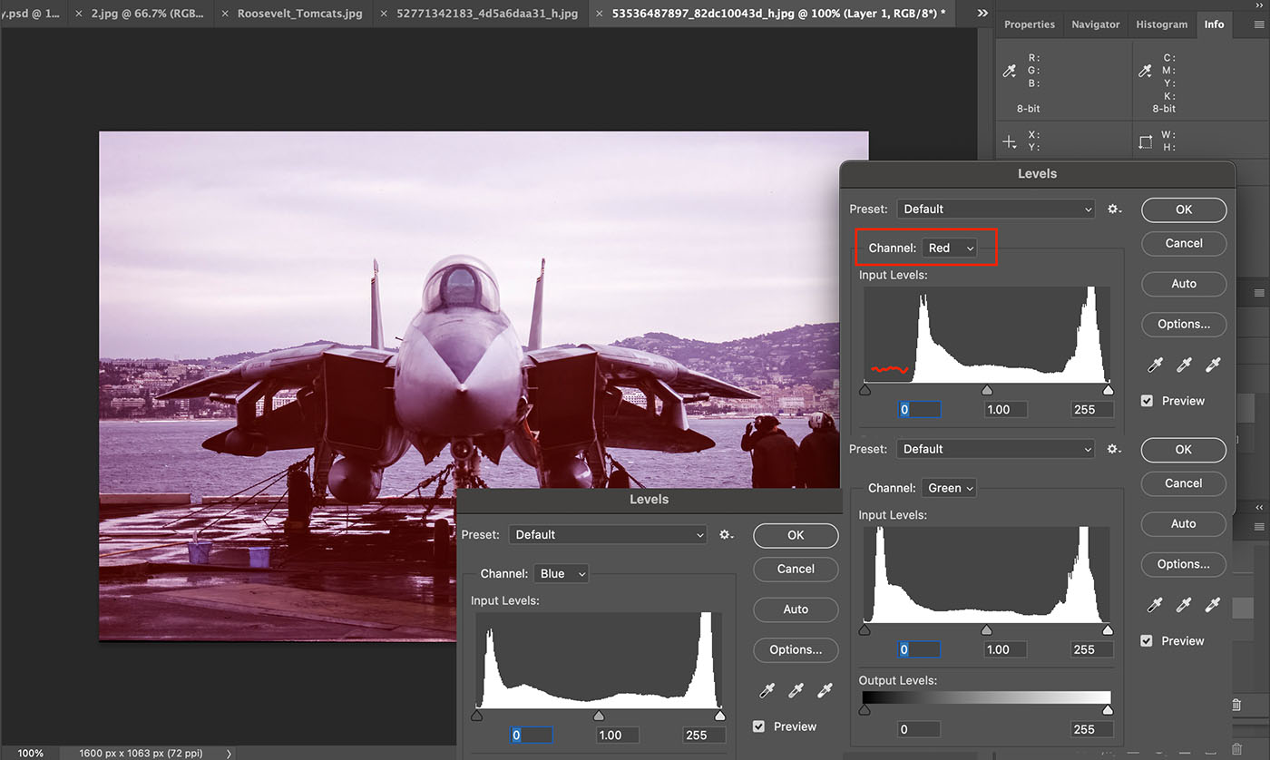
So for example, if your shadows or blacks have a red cast then in levels select the Red channel and ease the blacks slider to the right until the colour sampler shows a roughly equal number for red, green and blue
If there's a general colour cast and non of the "Autos" help then adjusting the colour balance can improve It, use the sliders to ease back the colours that are causing the cast, don't forget in colour balance you can select and adjust highlights, midtones and shadows or use Levels on a per channel basis and be patient and gentle with the corrections on the sliders - too heavy handed and you'll soon loose your way completely.
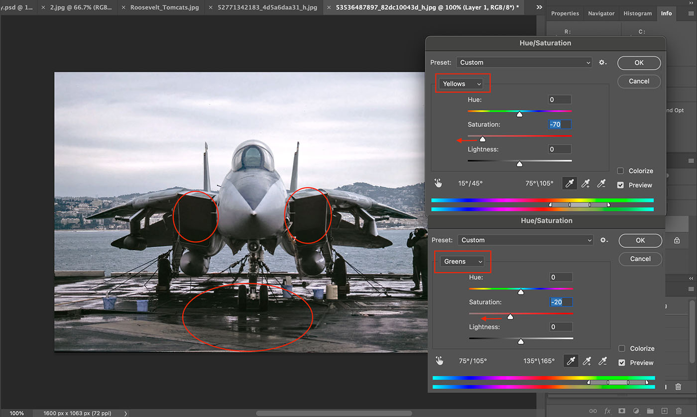
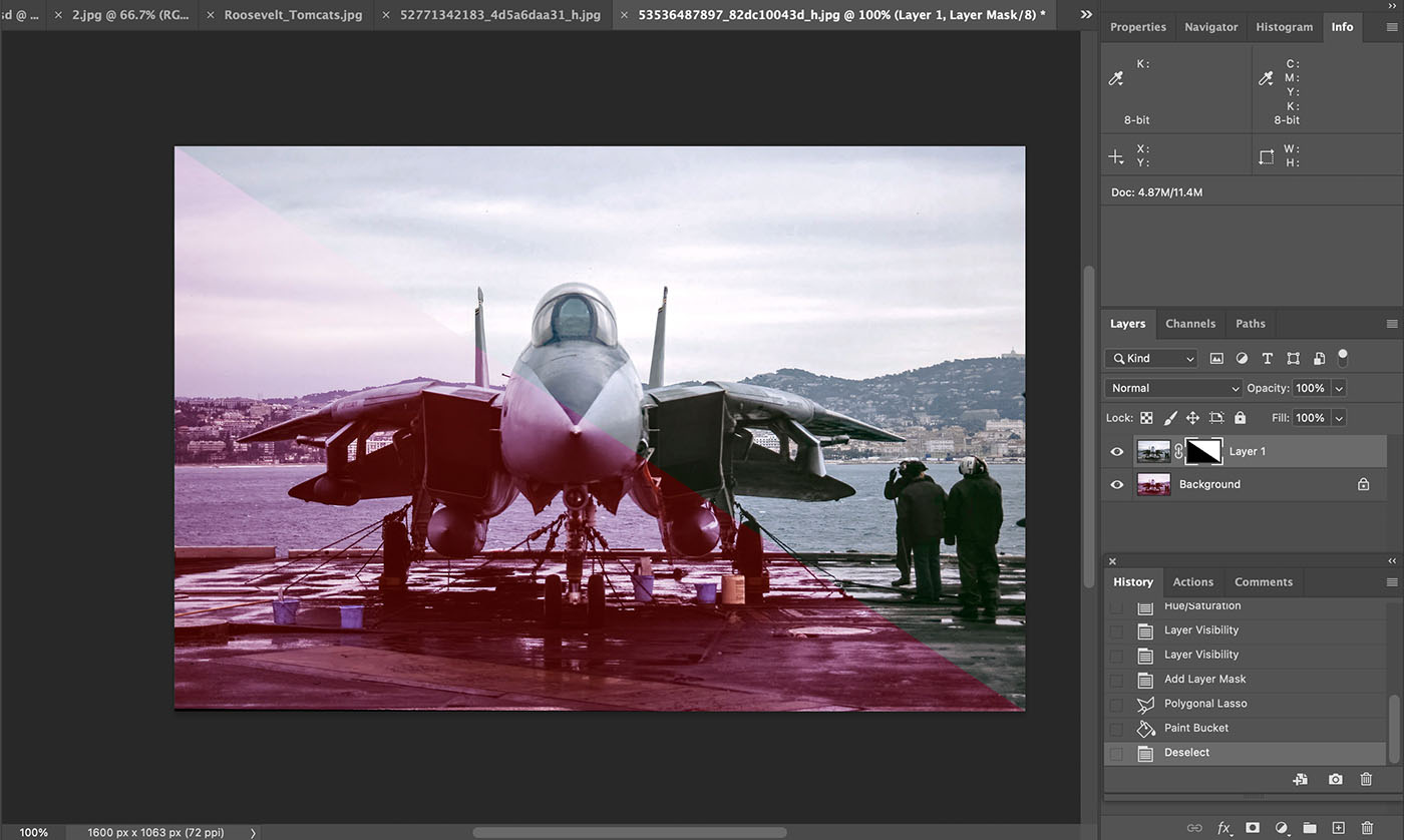
Another trick I use is reducing colour specific saturation, if you have a horrible cast or colours you can't get rid of, then try desaturating that specific colour, works really well for grey aircraft because grey is grey in black and white and by reducing the saturation of some colours you are heading towards creating a black and white picture, key is is use layers to allow you to mask back in colours where you need them, example on your Tomcats is yellow, I had a horrible yellow/green cast on the flight deck, so new layer via copy, then on that layer reduce the saturation for yellow and green until the deck had a better black tarmac tone about it and then used masking and a brush to paint the bright yellows back through from the layer below - yellow names, below the canopy and stripes on the tail fins and yellow lines on the deck and tow frame.
This technique is good for getting rid of colour casts in sky when the rest of picture is good, so say for a red cast in the sky, reduce the saturation of red (Adjustments... Hue/Saturation).
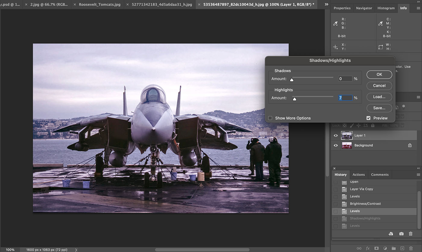
For exposure I use one or more of Adjustments - Levels, Exposure and/or shadows/highlights.
Sorry I cannot be more specific than that... edit...
I've tried a run through on a different shot to demonstrate some of these techniques... next post.
Kev

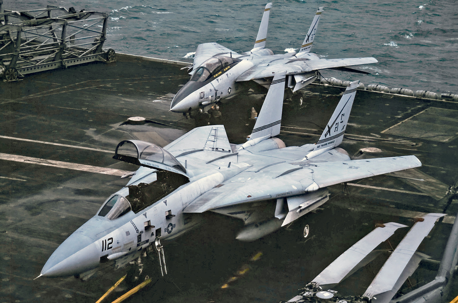
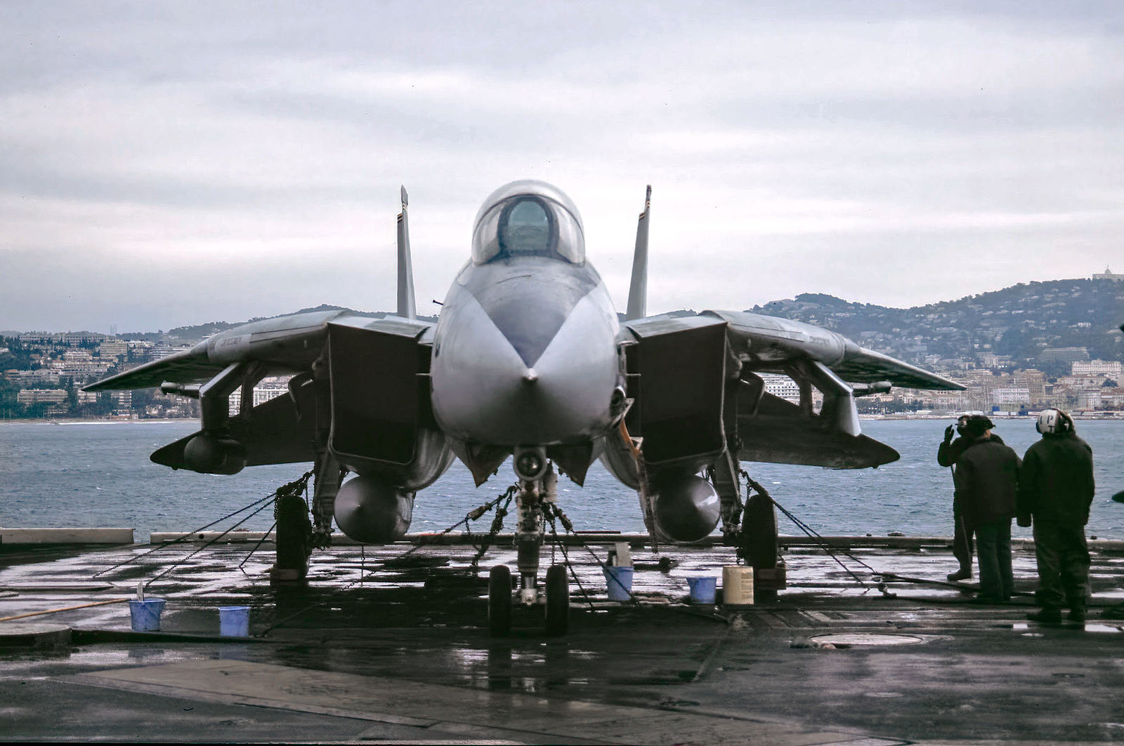
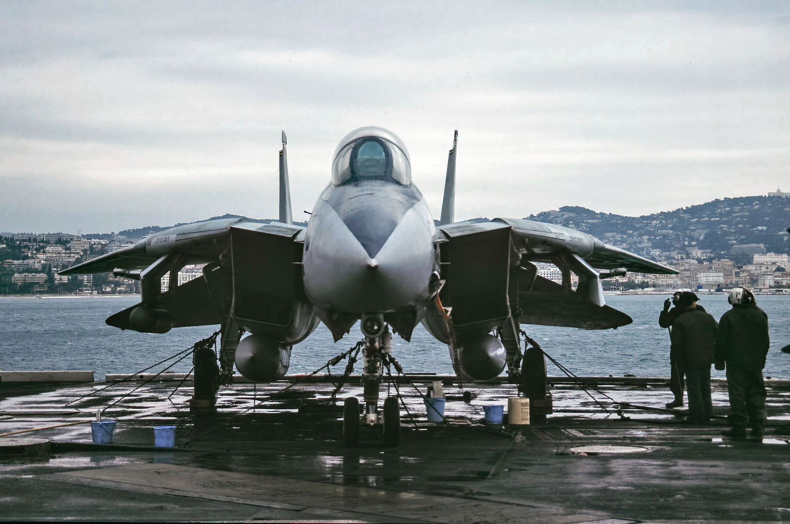
 CVN-71 #2 199612261500 by Bart van den Bogaert, on Flickr
 CVN-67 USS Theodore Roosevelt #2 199612261500 by Bart van den Bogaert, on Flickr
 F-14 #2 CVN-67 USS Theodore Roosevelt 199612261500 by Bart van den Bogaert, on Flickr
 CVN-71 S-3B 160600_AC-704 199612261500 by Bart van den Bogaert, on Flickr
 CVN-71 S-3B 160606_AC-706 199612261500 by Bart van den Bogaert, on Flickr
 CVN-71 160122_AC-700 S-3B 199612261500 by Bart van den Bogaert, on Flickr
 CVN-71 161550_AC-603 E-2C 199612261500 by Bart van den Bogaert, on Flickr
 CVN-71 164239_AC-403 FA-18C 199612261500 by Bart van den Bogaert, on Flickr
 CVN-71 EA-6B 163402_AC-621 199612261500 by Bart van den Bogaert, on Flickr
 CVN-71 164261_AC-401 FA-18C 199612261500 by Bart van den Bogaert, on Flickr
 CVN-71 160900_AC-106 F-14A 199612261500 by Bart van den Bogaert, on Flickr
 CVN-71 162697_AC-103 F-14A 199612261500 by Bart van den Bogaert, on Flickr
 CVN-71 160406_AC-106 F-14A 199612261500 by Bart van den Bogaert, on Flickr
 CVN-71 161135_AC-115 F-14A 199612261500 by Bart van den Bogaert, on Flickr